Crummy State Flags
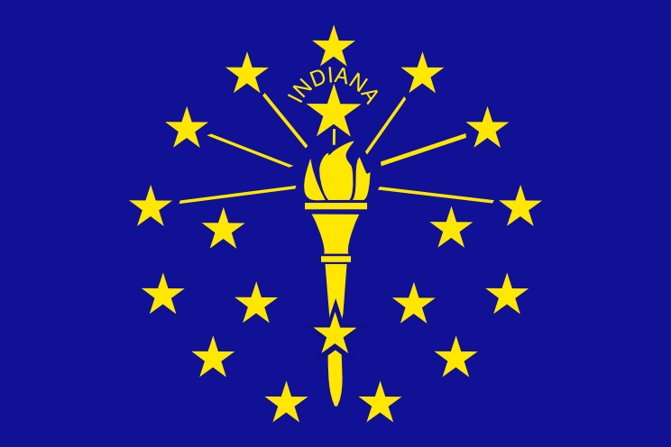 Why are US State flags so bad? Most world flags are not really very bad. Some time in the past someone decided that flags should have your national colors on them, and maybe an emblem like a fleur-de-lis or something representative of your country. How did Americans get it so wrong? Ohio decided that the best flag would be some kind of clipped pennant. Tennessee does not seem to understand proportions and has three five pointed stars jumbled together all in the middle. And what is going on with this Indiana flag?
 Most US states decided -- for some reason -- that the ideal flag was their state seal on a neutral background. Where did this idea come from? Was this something on the Puritan agenda? Illinois and Michigan split the pot for ugliness but the overall prize for worst flag in the US has to go to Kansas. Even aside from the "THIS IS WHERE YOU LIVE" font on the word "Kansas" and the coloring book graphics (notice the sunflower wisely making a break for it) who thought it would be a good idea to put mountains on the Kansas flag?
My vote for best state flag, and there aren't very many contenders, is the Alabama flag. I know it's a veiled reference to racism and secession but at least they get the idea of what a flag is supposed to be like.
posted by apk01004 at 12:23 AM
![]()


0 Comments:
Post a Comment
<< Home